
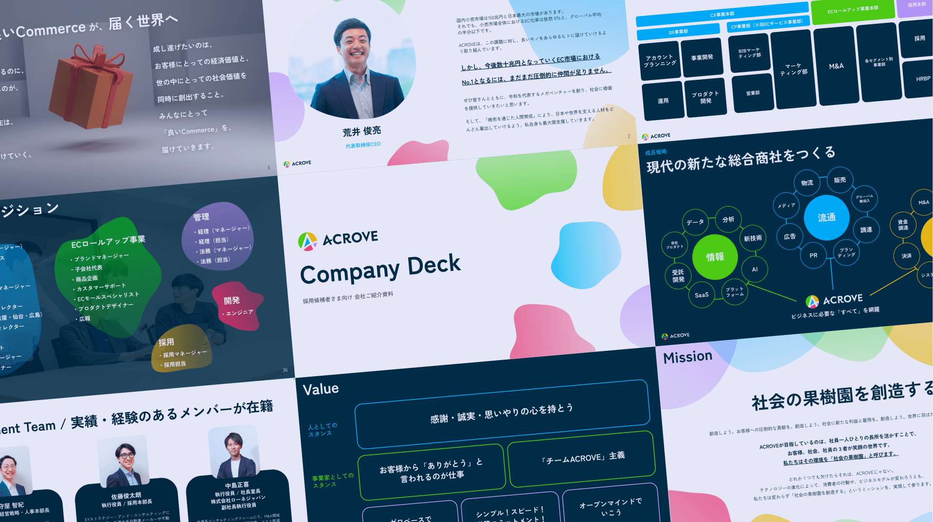
Raising a flag toward the same goal, through discussion

First I carefully hear out the client's needs, deepening a shared understanding of "what they want to convey through the deck." At times I put forward designer-side proposals and hypotheses, searching for a better result together.
The aim is to start moving toward the same goal by holding a shared understanding. The output ends up matching the need — and the process itself becomes smoother and more constructive.
Concretely, the primary goal became "clearly conveying ACROVE's potential, its business, and the appeal of its organization to candidates and agents."
Keeping impact front of mind
I constantly search for the solution that creates the most impact for a given problem. This time, I reinterpreted the existing deck from the ground up and designed it so the most important content stands out.
For example, the "Mission" slide casts colorful blobs as fruit, depicting society's orchard. I varied type sizes to convey the message as fully as possible.
I also pay attention to how I prioritize work, starting from what is both "high impact" and "easy to produce." That leads to high-value output from the very beginning.
Portraying an energetic, tenacious elite

The slime-like decorations in the deck are called "blobs" — masses, or clusters. Both as individuals and as an organization, ACROVE is in the thick of growth; no one can quite picture its future shape.
Blobs were perfect for expressing how individual "masses" gather into an infinitely expanding team. The colorful palette gives a young, energetic impression.
I designed the charts and graphs to read intuitively, too. As someone who specializes in UI/UX design, I find information design an enjoyable process.
From both emotion and logic, I finished a deck where you understand what kind of company it is at a glance.
Building with "beyond completion" in mind
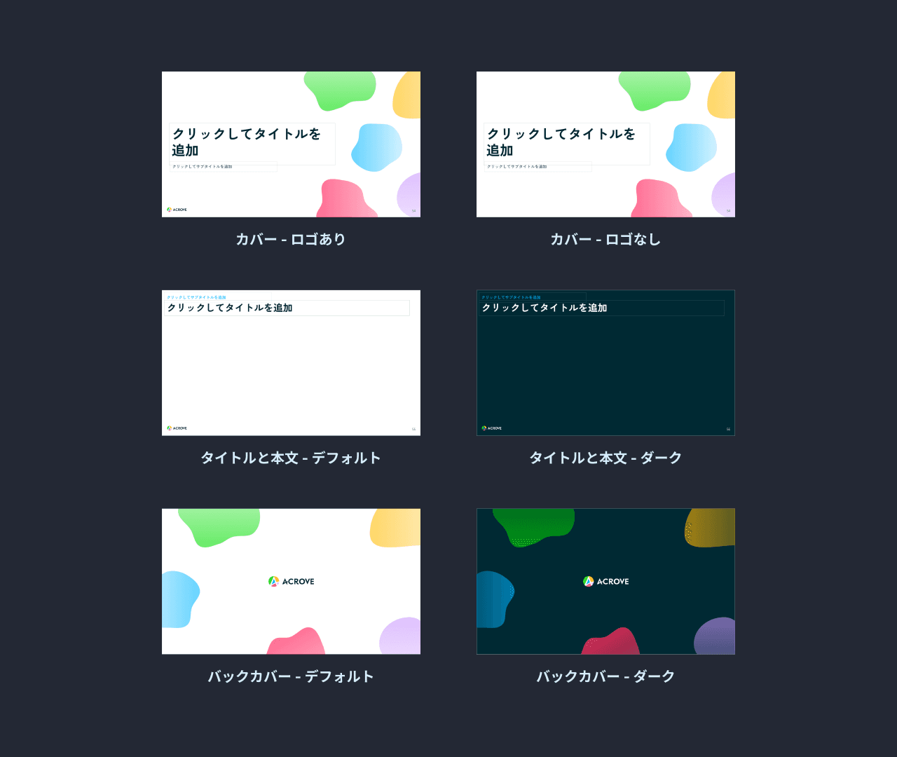
Because the deck was expected to be updated frequently, I built it from the start with "slides that are easy for non-designers to edit" in mind.
Beyond the Google Slides template, I sweated the behind-the-scenes — keeping each slide's structure as simple as possible. (It makes the design easier to keep consistent, which dramatically improved my own efficiency.)
By tuning the balance of backgrounds and layout, even a 50-page deck stays engaging to read.